PeekaBox
Stickers
Photography by me
Photography by me
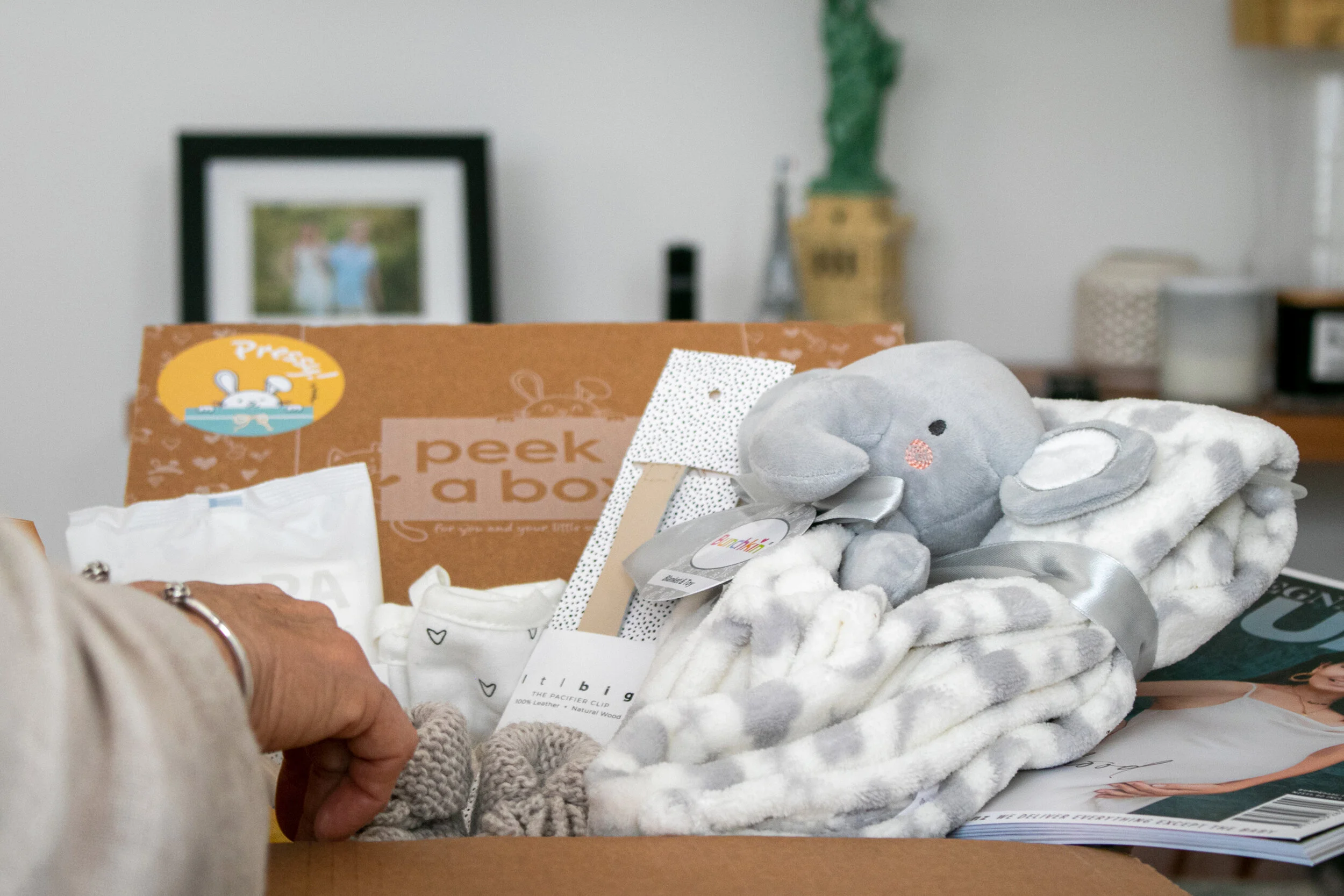
PeekaBox Pressy Sticker Design
Challenge: To design stickers for the new line extension of PeekaBoxes in order to stick them on the box.
Goal: Using existing brand elements to design stickers to identify the correct Box with the right contents especially to help with logistics and when it comes to packing.
Overview: One sticker was a Pressy gift Box that is paid with lots of valuable goodies to give to a new mum. The other box is a free box for new mum but had children already.
Concepts
Above there are some of the initial concepts that were proposed of stickers. This was done using existing brand elements from the new logo as well as adding other design elements. I designed based on the idea of a ‘present’ to give it a sweet but playful look.
Final Developments and Design
There was another brand colour that was introduced into the brand whilst working with the client. This helped to differentiate from other Boxes that PeekaBox offers. The final design chosen was a simple yet effective design.
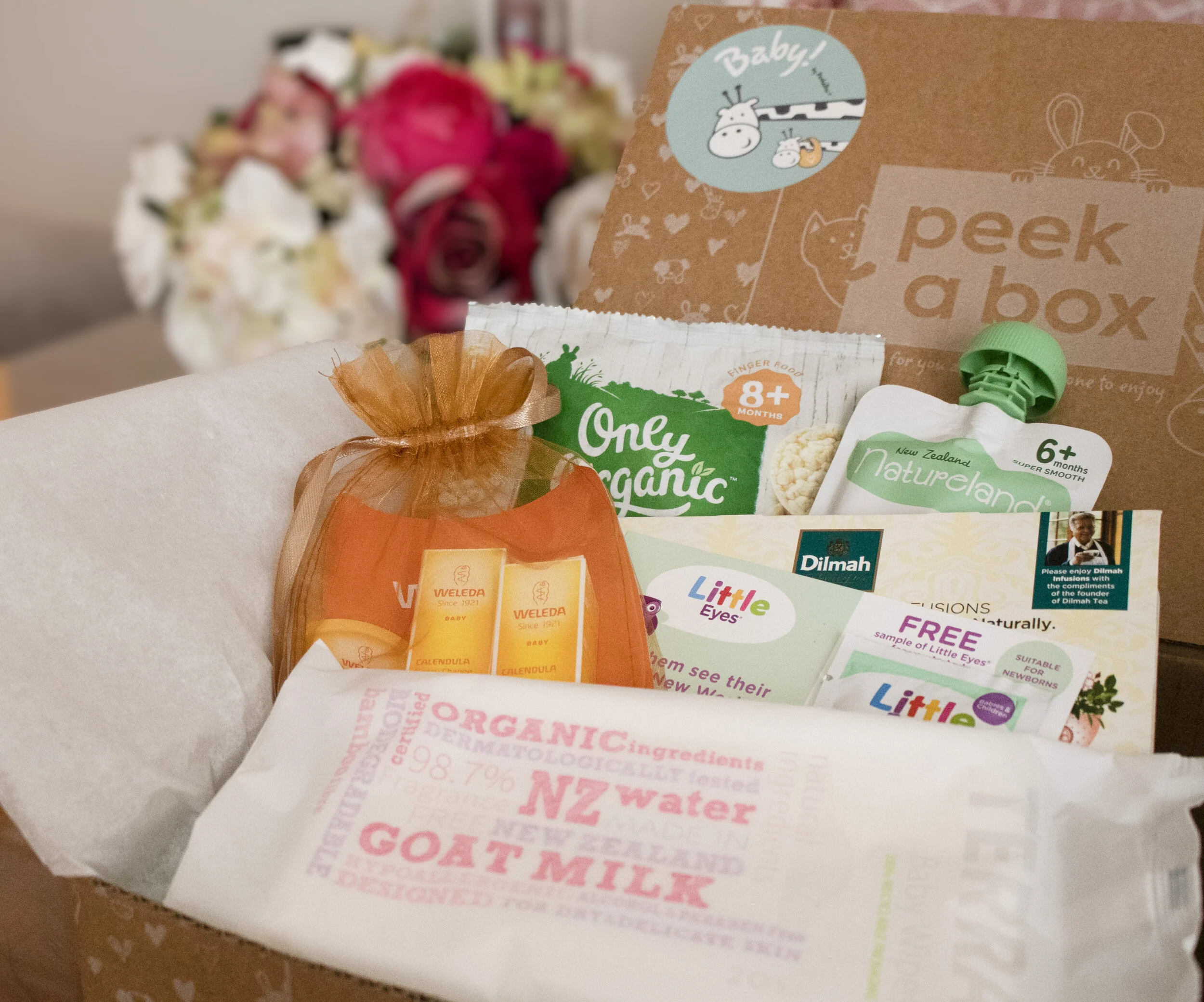
PeekaBox Baby Stickers
Concepts and Developments
I used the giraffe from the PeekaBox logo to create a baby sticker. I tested out simple designs and designs the would represent the word ’ Baby’. As shown, you can see a taller (mother giraffe and a smaller baby one that has a bib on. I also used other brand elements to incorporate into the sticker design.
Final Design
The final discussed design was using a font that was from the box. The smaller giraffe nesting in the taller one and kept the bib to represent the baby. This sticker has colours opposite to the final present sticker design (shown earlier) with blueish green as the background and a pop of the yellow/mustard colour that was introduced.


